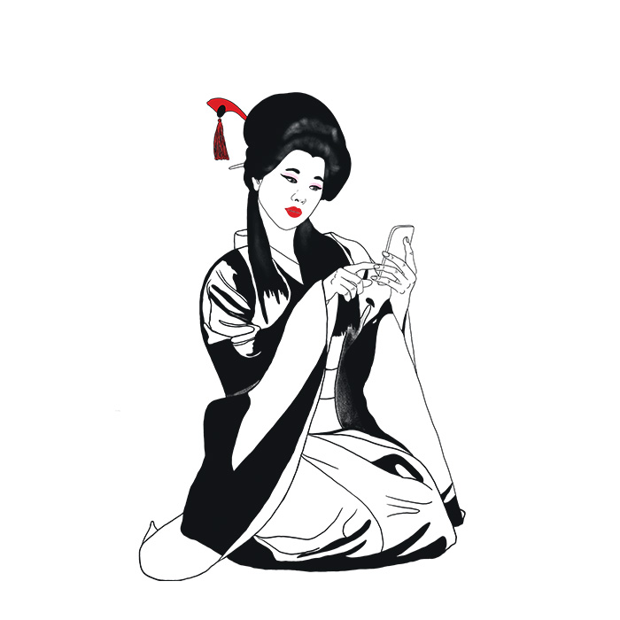
Japandi: where Northern Minimalism meets Eastern Serenity
"Japandi is not about perfection, but about intentionality. Every line, every mark has its place and purpose within the image."
Lately, you've been asking me where I draw inspiration for my recent illustrations and my renewed color palette. If I had to choose just one word, it would be Japandi.
Though it originally set out to conquer the world of interior design, as an illustrator, I see this aesthetic as the perfect recipe for visual decluttering and intentional creation.
What exactly is Japandi? The name is a fusion of Japanese minimalism and Scandinavian (Scandi) functionality. It is the meeting of two seemingly distant worlds held together by shared values: respect for nature, quality over quantity, and the principle of "less is more."
Scandinavia: brings the hygge lifestyle—comfort, coziness, and light-filled spaces.
Japan: adds the wabi-sabi philosophy—finding beauty in imperfection and rustic elegance.
Why do we love it as graphic designers?
Japandi is not just about furniture; it is a complete visual language that we, as creators, can use to great effect:
"Breathing" Negative Space: Just as a breezy layout is crucial in a Japandi living room, we leave room for the eyes to rest in our illustrations. Here, negative space is not "empty"—it is an organic, emphasized part of the composition.
Earth Tones and Contrasts: We can forget about sterile, cold whites. The palette is based on colors like oat, sand, and stone, which we contrast with deeper tones—such as anthracite, indigo, or burnt sienna—to reflect the Japanese influence.
Textures and Organic Lines: In my digital drawings, I try to translate the tactile feel of natural materials (wood, linen, paper). Instead of needle-sharp, sterile lines, we can choose slightly grainy, "analog-style" brushes.

How to bring a little Japandi into your Creative Process
If you'd like to feel this sense of calm in your own work (or even around your desk), here are a few tips:
Limited palette: Restrict yourself to a maximum of 4–5 nature-inspired shades within a single project.
Natural imperfection: Don't be afraid of asymmetry! A hand-drawn, slightly trembling line brings much more life to an illustration than a perfect geometric circle.
Functional minimalism: Ask yourself: "Does this detail add something to the message, or is it just decoration?" If it's just decoration, let it go.
Daily inspiration For example, in my latest print series, I intentionally stripped away complex shading to achieve that specific Japandi vibe. The result? A much cleaner, more meditative visual world.

