Master of silent beauty: the life and work of Shiro Kasamatsu
As graphic designers, we often seek the perfect balance where technical precision meets emotional depth. If there is an artist who mastered this to perfection, it is Shiro Kasamatsu (1898–1991). His work serves as a bridge between the past and the present: he infused the world of traditional Japanese woodblock prints (ukiyo-e) with a modern, almost cinematic perspective.
Why should a contemporary illustrator study his legacy today?
1. The soul of the "Shin-hanga" movement
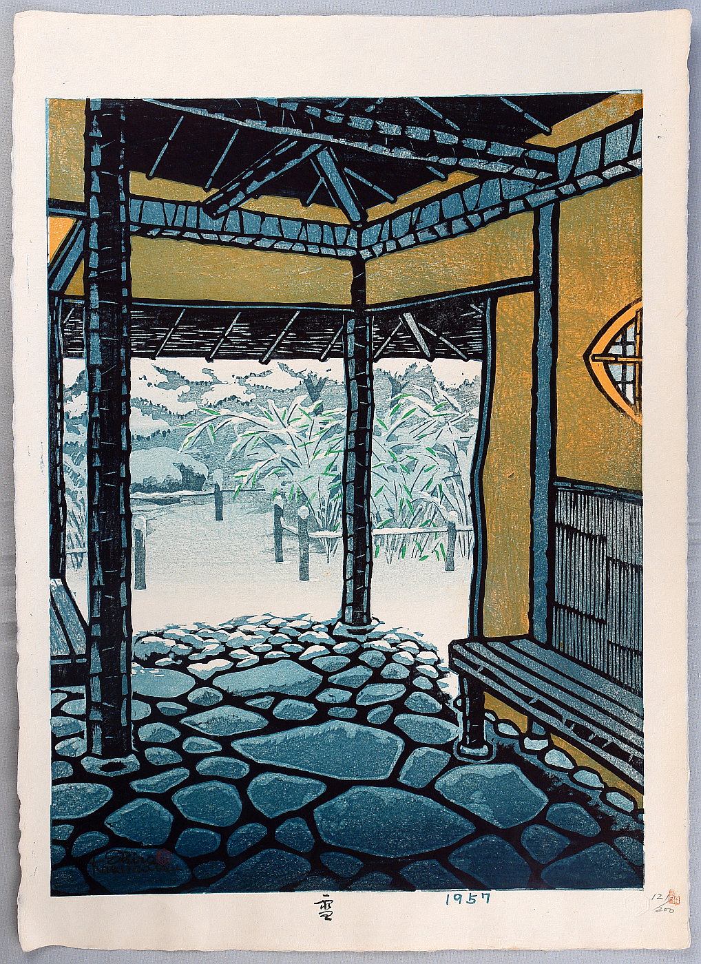
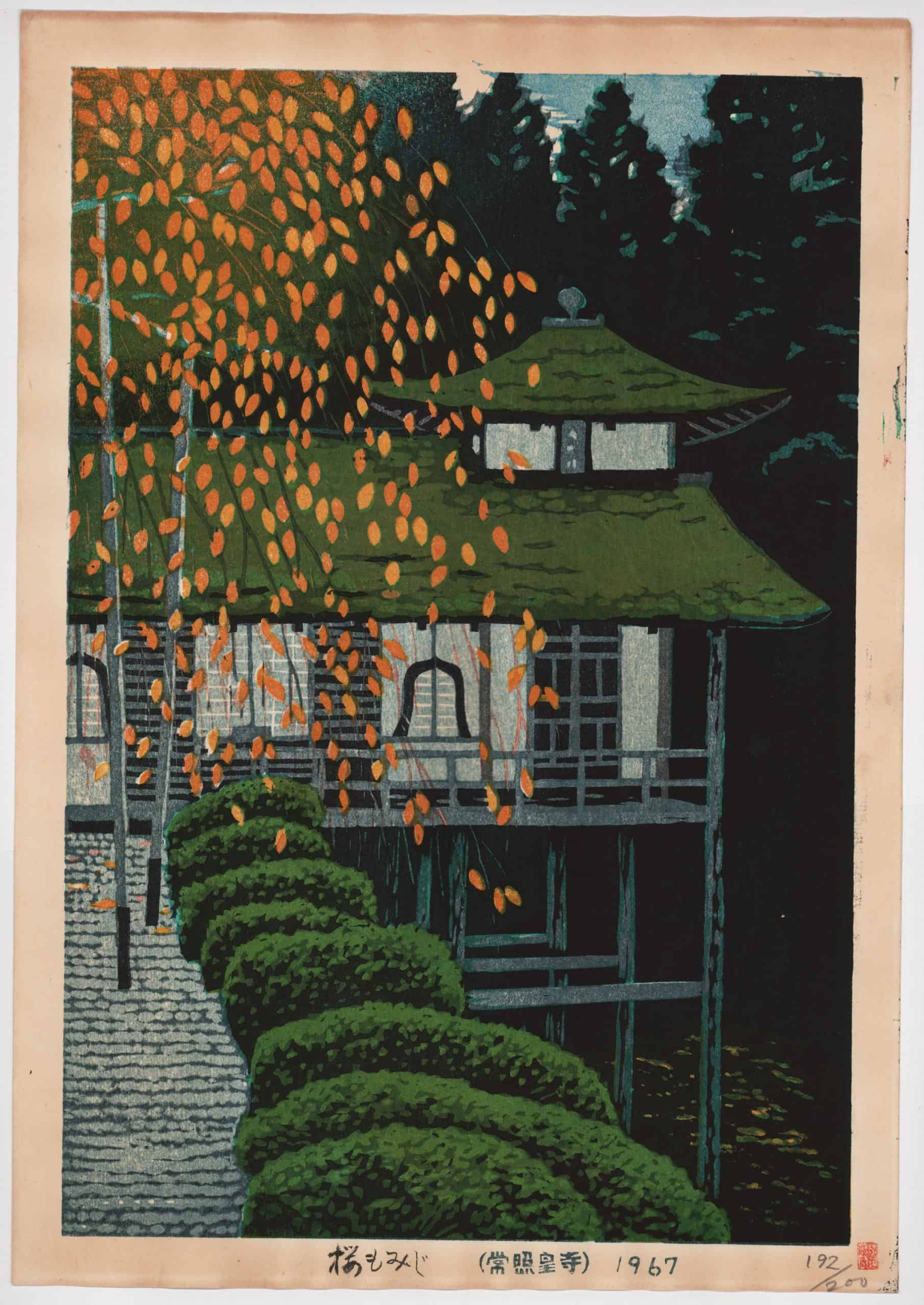
Shiro was a leading figure in the Shin-hanga (New Prints) movement. While Western art was pushing toward realism, these artists combined traditional Japanese techniques—fine line work and hand-pressed block printing—with Western-inspired light-and-shadow effects and perspective. Shiro didn't just document Japan; he painted the atmosphere of its landscapes.
2. Master of negative space and composition
Look at any of his prints: Shiro brilliantly utilized the concept of "Ma", which in Japanese aesthetics refers to emptiness or the pause.
Less is more: his snow-covered rooftops or pagodas fading into the mist teach us how to leave room for the viewer's imagination.
Guided sight: he frequently used vertical elements, like trees or temple pillars, to frame the composition and add depth to a flat surface.
3. Color palette and emotional intelligence
Shiro's colors are never accidental. The deep blues of twilight, the warm orange of lanterns, or the pastel pink of spring rain are not just visual elements—they dictate the rhythm of the image. From a designer's perspective, it's fascinating to see how he achieves incredible richness using only a few well-chosen tones.
4. Lessons for today's digital artist
Although Shiro worked with wood and pigment, his principles remain valid in the age of Photoshop and Procreate:
Direction of light: notice how he "lights" his scenes. For him, light always tells a story.
Texture: the grain of the woodblock reminds us that our digital work often benefits from a touch of "organic imperfection."
"One must capture not only the sight but the vibration of the air itself." — This could easily be Shiro Kasamatsu's motto.
His work inspires us to slow down. In a noisy world where graphics often scream for attention, Shiro proves that the loudest messages are sometimes delivered in the greatest silence.
The art of silence: 5 digital painting tips from a Shin-hanga legend
1. Conscious use of "Bokashi" gradients
In woodblock printing, bokashi is a hand-applied ink technique where water is used on the block to create a soft fade.
Digital tip: Don't just rely on the standard Gradient Tool. Use a large, soft, textured brush with low opacity to layer colors manually. This creates a more organic, "airy" effect typical of Shiro's misty landscapes.
2. Selective line-weight and outlining
Shiro didn't outline everything. Often, background elements (mountains, distant houses) have no black contours; they are defined only by color shapes.
Digital tip: Experiment with keeping your line art only for foreground or focal elements. For distant objects, "cut" the lines or color them to match the environment. This adds instant depth to your work.
3. The "Keyblock" as texture
The black lines (keyblock) provide the structure in Shin-hanga. Shiro, however, sometimes allowed the wood grain to show through the print.
Digital tip: Add a subtle paper or wood grain texture layer on top of your finished illustration in Overlay or Multiply mode at a low fill. It breaks the "digital perfection" and gives the piece a tactile feel.
4. Limited palette and tonal contrast
Shiro was a master of using a single dominant hue (like nocturnal blues) broken by a single complementary accent (like the yellow glow of a lantern).
Digital tip: Try the 70-20-10 rule: 70% dominant tone, 20% supporting shade, and only 10% for the high-contrast focal color. This ensures the viewer's eye goes exactly where you want it.
5. Dramatic lighting (Chiaroscuro, japanese style)
While Japanese art is traditionally flat, Shiro used light sources (moonlight, interior glow) to "bite" shapes out of the darkness.
Digital tip: When painting night scenes, avoid pure black for shadows; use deep indigo or dark violet instead. Use Linear Dodge (Add) for light sources, but keep the edges of the light shapes sharp, as if they were carved out of wood.


